Usability Tests and Metrics with the depth of AI-Moderated Interviews
How Strella visualizes your AI-moderated usability tests: task completion, time on task, path maps, Figma click heatmaps and emotion signals, each paired with the participant's own explanation.

UX Research teams have long had to choose between scale and depth. Unmoderated tools return completion rates, times and click paths across a large sample, with little of the reasoning behind them. Moderated sessions capture the reasoning, but they are slow to run, and the metrics come from rewatching recordings by hand. Strella now produces the standard usability metrics inside AI-moderated interviews: task completion, time on task, path maps, click heatmaps and emotion signals.
Metrics or reasons, rarely both
In unmoderated testing, a failed task shows you where someone struggled. It rarely tells you why. In moderated testing, you hear the why in the moment, but each session costs a researcher's time, and turning a week of sessions into pass rates and paths is its own project.
Jakob Nielsen's rule from 2001 still holds: "Watch what people actually do. Do not believe what people say they do." The catch is that watching behavior and understanding it have usually lived in different tools, or at very different costs.
How AI moderation adds depth to traditional usability testing
In Strella, every participant gets a moderated session. They share their screen and think aloud, and the AI moderator follows up as they work. Strella now also reads the screen recording, so the metrics you would expect from a usability platform come out of that same session, for every participant.
When a task's pass rate drops, you do not stop at the number. The path map shows which screen lost people. From there you can click through to the participants who left and hear what they expected to find.
Five views: four read the screen, one reads the person
Here is what Strella produces for each task.
- Task completion. Did they finish? A pass or fail call on every recording, and a pass rate for each task.
- Time on task. How long did it take? The median time across participants, with the spread.
- Path map. Which route did they take? A flow of every screen people moved through, and where they stopped.
- Click heatmap. Where did they tap? Heat drawn over each screen of an imported Figma prototype.
- Emotion signals. How did it feel? Moments tagged as delighted, interested, hesitant, skeptical, confused, frustrated or indifferent, beside the transcript.
The first three work on tasks run on a live website or app. The heatmap is for Figma prototypes. Emotion signals are off by default and only appear where participants have agreed to them.
Task completion is graded from the screen, not from what people say
Nielsen and Raluca Budiu call success rate "the simplest usability metric": the percentage of users who were able to complete a task. As they put it, "if users can't accomplish their target task, all else is irrelevant."
Strella calculates that number by watching each screen recording frame by frame and judging only what is visible. A participant saying "okay, I think I found it" does not count. Opening the right menu or clicking toward the goal does not count either. The screen has to reach the end state the task asked for.
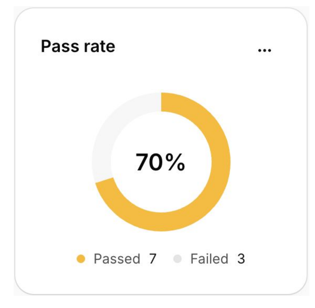
Two details keep the rate honest:
- Ungraded is not failed. If the screen never appears in the recording, or the outcome is not clear before the recording ends, that participant is left out of the count rather than marked a fail.
- The reason is on record. Every participant gets a Passed or Failed badge, and you can ask Strella's AI chat why someone failed. It answers from what happened on screen.
Read a pass rate as a signal rather than a verdict. It tells you which task to look at. The other views tell you what went wrong inside it.
Time on task is most useful compared task to task
The clock starts when the task starts and stops when it ends. Everything in between counts: exploring, thinking aloud, the question a participant asks halfway through. Strella shows the median time with a box plot of the spread, and an outliers toggle sets aside unusually long or short runs.
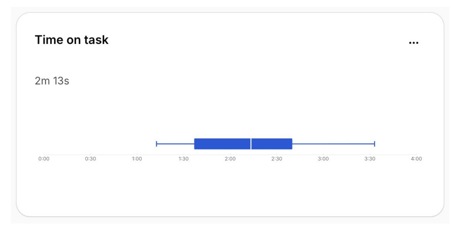
There is no separate "time until they hit the goal" figure. Because think-aloud time is included, the number means more when you compare it across tasks, or across two versions of the same flow, than when you read it on its own.
A path map shows where the flow broke
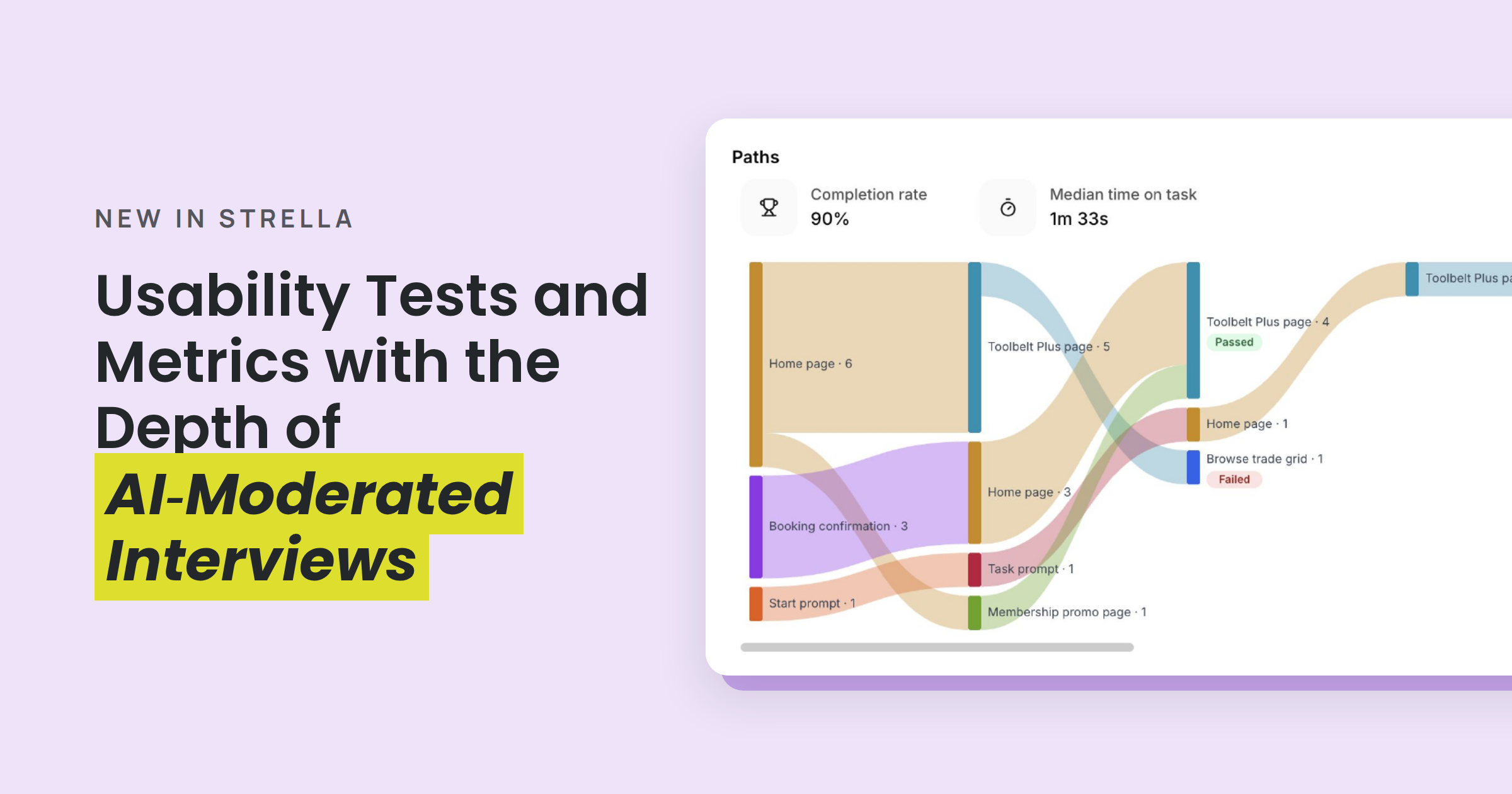
For tasks on a live website or app, the Paths chart combines everyone's routes into one flow. It is worth learning to read, because the shape usually tells you more than the detail:
- Each bar is a screen. Its height is how many people reached it.
- Ribbon thickness is how many people took that exact step.
- A split means people disagreed about where to go next.
- Orange is where people stopped and never came back.
- The last bar is where the flow actually landed.
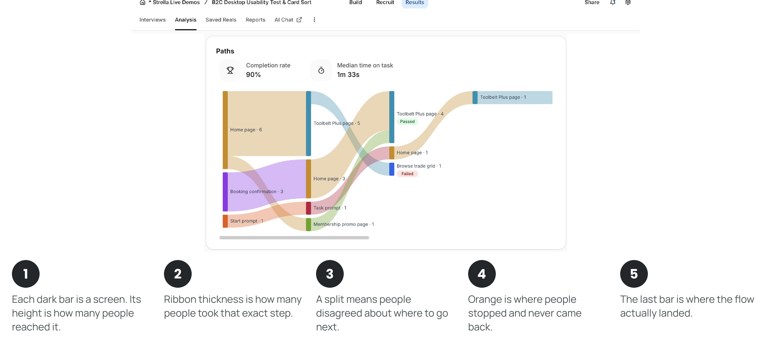
Select any screen or connection to see a screenshot, how many participants it covers, the average time spent there, and their faces. Select a face to jump to that participant's screenshots and transcript. That is where the metric turns back into a conversation.
Three shapes worth knowing
You are reading shape, not detail. These three cover most of what a path map will tell you.
- Converging. One clear route. The flow is working.
- Splitting. People disagree about where to go. The step is ambiguous.
- Fraying. A thick band peels away. That screen is a dead end.
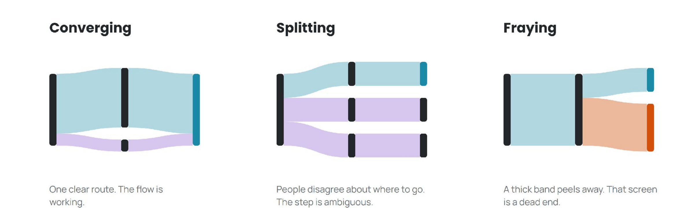
An illustrative example: "Update your payment card"
Picture a task asking 24 people to update the payment card on their account. The path map might show three things:
- Billing is the cliff. Nine people never finished. Four of them left from Billing, more than from any other screen.
- Account Home isn't pointing anywhere. A third of participants tried Search or Profile before they found Settings.
- Help Center is a dead end. Three people went in. One came back out.
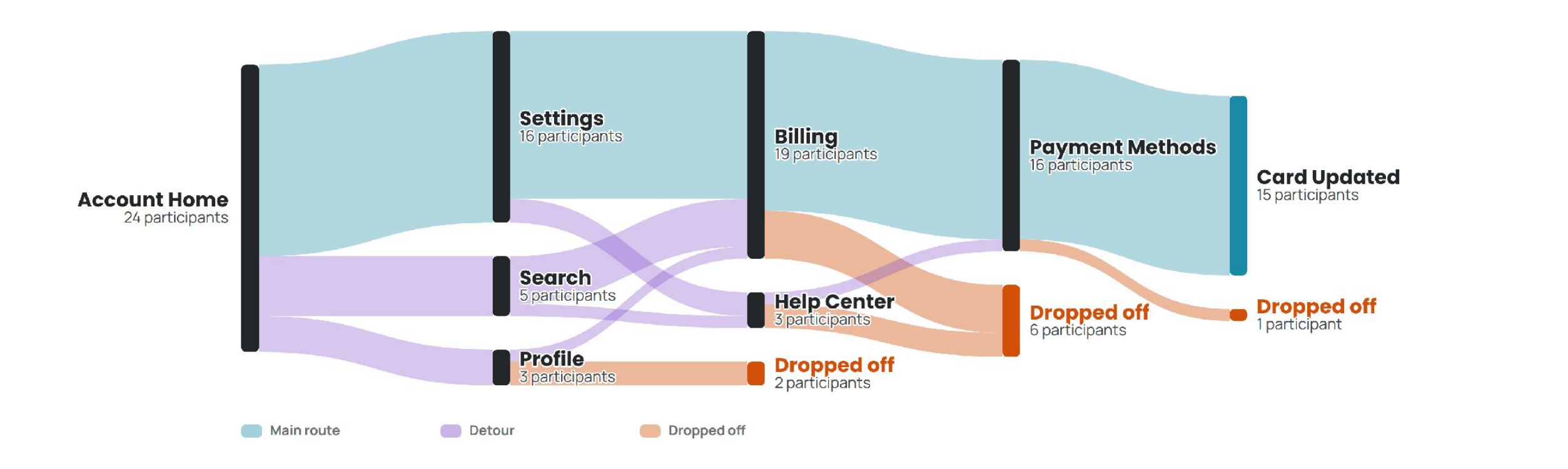
None of those findings required a researcher to watch a single video first. All three tell you exactly which clips to watch.
Getting a path map worth reading
- Give it a group, not a handful. Ribbon thickness is a headcount. With a few participants you get thin threads. With a proper group, the common route stands out.
- Let people find their own way. Step-by-step instructions produce one route and a chart with nothing to say. Ask for the outcome ("update your payment card") and let them navigate.
- Write a clear end state. "Reach the order confirmation page" gives the grader a clean line between pass and fail.
Click heatmaps show which part of a screen went wrong
A path map tells you which screen lost people. A heatmap tells you which part of it did.
For tasks built on a Figma prototype imported through Strella's Figma integration, Strella records where people tapped and draws it as heat over each screen. Bright means many people aimed there. Faint means a few did. Two patterns are worth looking for:
- Heat on something that isn't tappable. A heavy blob on a label or an image usually means people expected a control there.
- Heat just beside the target. Clicks clustered next to a button usually mean it is too small, too low, or doesn't look like a button.
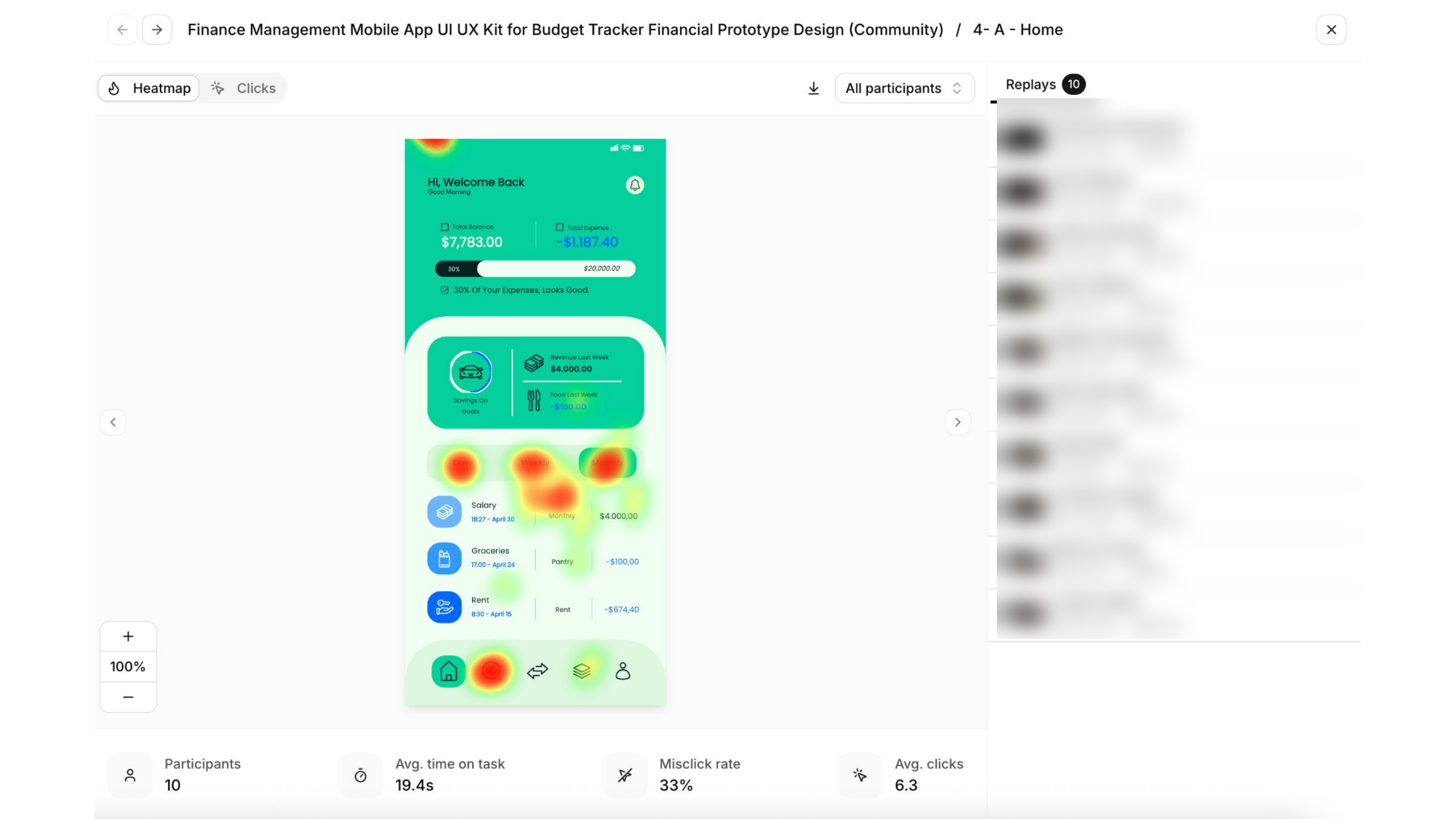
Prototype tasks also show a misclick rate, a screen flow, and click paths, which are split into completed and failed for goal-based tasks.
Emotion signals are bookmarks, not measurements
When emotion analysis is on, Strella reads participants' facial expressions during the conversation, sentence by sentence, and flags moments when they seem confused, hesitant or delighted, going beyond just what is in the transcript. An Emotional responses card shows how many participants landed in each state.
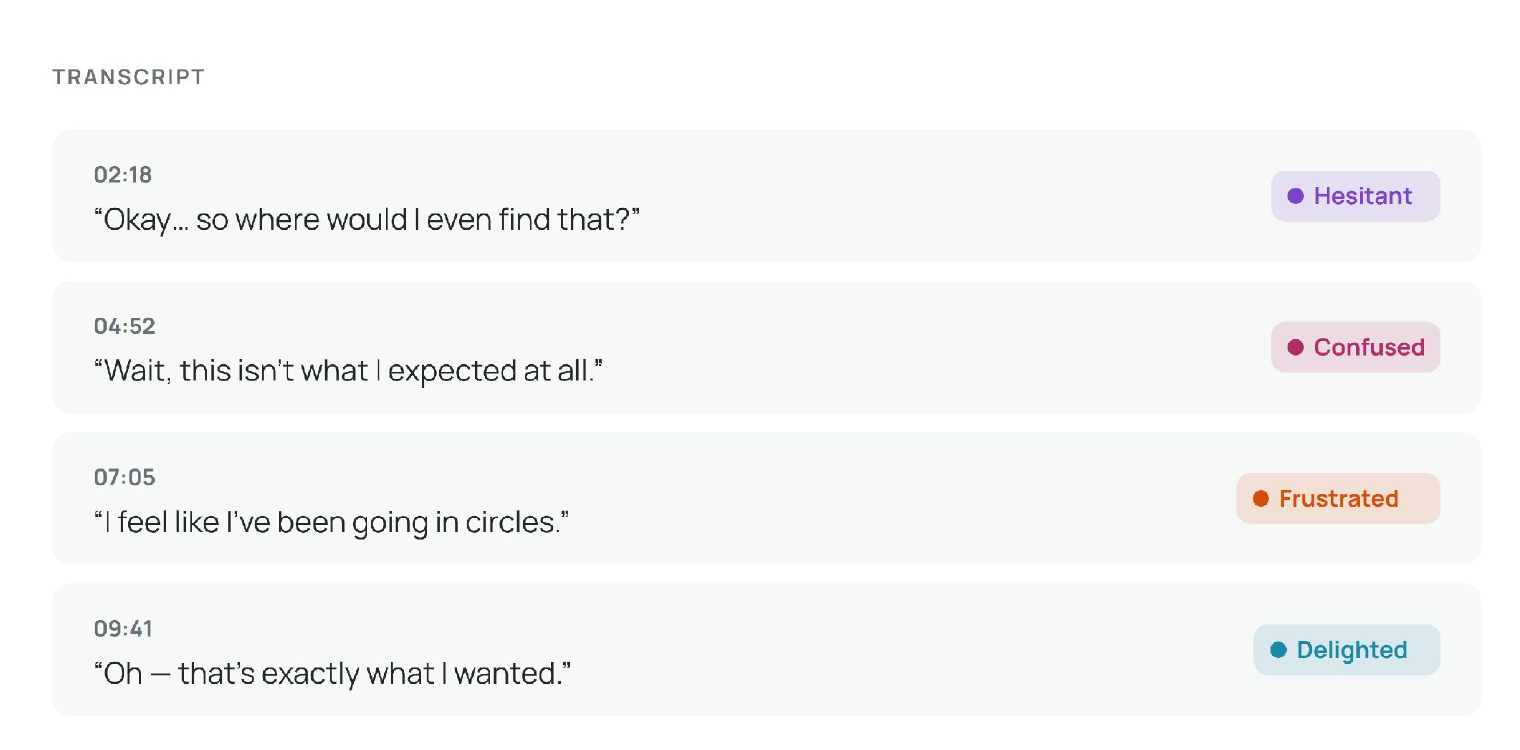
It is built with guardrails on purpose:
- Off until you turn it on. It is a setting you enable, not a default.
- Consent comes first. Tags only appear for participants shown the notice when they joined, and only when cameras are not blurred.
- A tag points you at a moment. Concentration can look a lot like mild frustration, and some people are pleased without showing it. Use a tag to find a moment worth watching, then judge it from the recording and what the participant said.
- Some studies are off limits. Emotion analysis is prohibited in workplace and education settings in the EU, EEA and UK, and restricted in some US states. Do not use it to study employees, job candidates or students.
A quick checklist for your next usability study in Strella
Every recording in the project gets graded, timed and mapped, and the charts update as each interview finishes. When a number looks off, the explanation is one click away, in the participant's own words. To get the most from it:
- Turn on screen recording for any task you want metrics on.
- Write each task around an outcome with a clear end state.
- Don't script the route. Let people navigate.
- Recruit enough participants for the path map to show a pattern.
- For prototypes, connect Figma and import the prototype so clicks are recorded.
- Turn on emotion analysis only where consent and local rules allow it.
- Start with the pass rate, find the break in the path map, then watch the clips it points to.
FAQ
How does Strella show resulta of usability tests?
Strella visualizes each on-screen task from the screen recording. It grades pass or fail, times the task, and maps the screens each participant moved through. Figma prototype tasks add a click heatmap and misclick rate. Because the session is also an AI-moderated interview, the metrics sit beside each participant's explanation.
How does Strella decide whether a task was completed?
It judges only what is visible in the screen recording, not what the participant says. A task passes when the screen reaches the end state the task asked for. If the outcome cannot be seen, the participant is left out of the pass rate rather than counted as a fail.
What is a path map in usability testing?
A path map, sometimes called a Sankey chart, combines every participant's route through a product into one flow. Bars are screens, ribbons show how many people moved between them, and drop-offs show where people gave up. It shows where a flow broke without watching every recording.
Can Strella create click heatmaps from Figma prototypes?
Yes. Import the prototype through Strella's Figma integration and Strella records where participants tapped and draws a heatmap over each screen. A linked prototype without the Figma connection still works in the interview but records no clicks.
Is emotion detection in user research reliable?
It is useful for finding moments, not measuring them. Concentration can look like frustration, so Strella treats an emotion tag as a prompt to watch the clip.
Does time on task include thinking aloud?
Yes. Strella measures total elapsed time from the start of the task to the end, including exploring and thinking aloud. It is most useful compared across tasks or design versions.
Sources
- Jakob Nielsen, "First Rule of Usability? Don't Listen to Users," Nielsen Norman Group, 2001. nngroup.com
- Jakob Nielsen and Raluca Budiu, "Success Rate: The Simplest Usability Metric," Nielsen Norman Group, 2001 (reviewed 2021). nngroup.com
- Strella Help Center, "See how participants complete on-screen tasks." app.strella.io
- Strella Help Center, "See how participants use your Figma prototype." app.strella.io