How Boll & Branch Found Their Winning Design Direction in Just One Week
See how Boll & Branch's digital product and design teams used AI-moderated interviews to test designs with current bedding shoppers allowing them to arrive at final designs within a week.

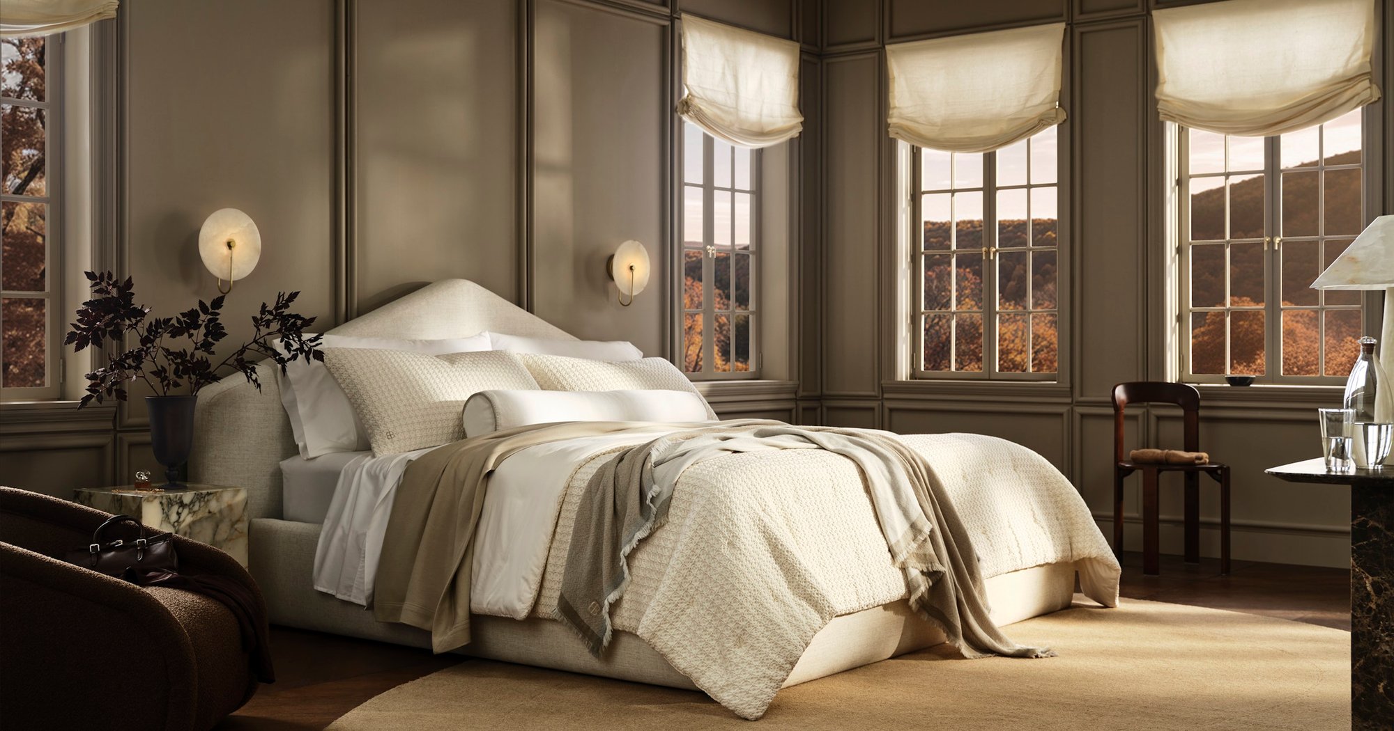
In one week, Boll & Branch's Digital Product and Digital Design teams put three mobile Quick Shop design options in front of 13 bedding shoppers on Strella. Rather than A/B testing every variation, the team wanted to understand which UX/UI direction resonated most with shoppers, and why. They came away with a consistent signal, the reasons behind it, and final designs ready for engineering hand-off within one week of testing.
The Challenge: Multiple Variables, Limited Screen Size
Boll & Branch, the luxury bedding and bath brand, wanted to introduce a Quick Shop experience for mobile shoppers. The team wanted to understand how product information, visual hierarchy, and interactive elements shaped the shopping experience on a limited mobile screen, with the goal of helping shoppers feel more confident adding to bag.
The team had three strong candidates. The streamlined version presented only essential product details: a single product image, title, price, and variant dropdowns. The comprehensive version added more product imagery, customer reviews, a brief product description, and an exposed color swatch grid. The third version, a blended option, sat between the two: more than the essentials, less than the full product page.
With this many variables in play, A/B testing alone would not explain why shoppers preferred one version over another. Testing the designs first with a small group of real shoppers let the team quickly learn what customers valued most from each variation.
The Approach: Let Customers Weigh In
The team built three Figma prototypes and tested them on Strella. They recruited mobile shoppers who had recently purchased bedding or home goods online. Participants completed a shopping task using each Quick Shop prototype, adding a sheet set to their bag. They then ranked the designs and explained what influenced their decisions.
Where a typical unmoderated usability test records what shoppers do, Strella's AI moderator also probed for the motivations behind their preferences. Understanding which information, features, and interactions mattered most, and why, gave the team deeper insight into shopper expectations. This helped the team combine the strongest elements of each design into a more effective experience, and go into testing with a sharper hypothesis.
The Workflow: From Last Session to Recommendation in Hours
Strella's AI synthesis produced a structured findings report within hours of the last session, with participant quotes tied to timestamps.
The Boll & Branch team started with the auto-generated summary to get oriented. They then used Strella's AI chat to dig into the questions that mattered most and to generate more detailed reports on each.
Highlight reels, short clips of the key moments pulled automatically from the interviews, filled in the gaps that the rankings alone couldn't answer. Rather than searching through lengthy recordings, the team could jump straight to the moment a shopper reached a specific step and watch what happened on screen.
We were weighing how much information to include in the experience. Strella helped us learn from real customers what information was critical, what was nice-to-have, and what was overwhelming on mobile. Within hours of the last session I had a report and highlight reels I could take straight to our Digital Product and Design teams.
Dani Smith, Senior Manager, Digital Product, Boll & Branch
Curious about what an AI-moderated interview is like?
The Result: A Consistent Signal, With a Why
The test was designed to give directional, rich feedback, and the signal was clear: 12 of 13 participants ranked the blended design first. But the ranking decision was only part of the feedback. Strella's clear outline of the reasons behind it helped the team refine the design further.
Follow-up questions turned a preference into a clear design signal. When shoppers favored an image gallery over a single thumbnail, Strella's AI moderator asked why. The answer was consistent: more imagery helped shoppers picture the product in their own space.
Screen and voice together showed where purchase confidence dipped. Each session captured the shopper's screen alongside their commentary, so the team could see where shoppers hesitated in the minimal version and hear why. The team used these highlights to watch how customers navigated color selection in real time and align on the optimal approach to presenting a large color range.
Open conversation surfaced nuance a rating scale would miss. Shoppers narrated their thinking as they moved through each concept, giving the team a fuller picture of what information mattered to them at each point in their shopping journey. That input helped the team decide what to pull into quick shop and what to leave to the product page.
The Impact: Moving Faster With Confidence
The team confirmed its final design direction within a week of the test closing. Customer research narrowed the field, synthesis took hours rather than days, and the team's A/B testing practice validated the final results.
The Case Study in Numbers
- 13 AI-moderated interviews with recent online bedding shoppers
- 3 mobile Quick Shop design options
- 1 week from launching the test to real customer feedback
- Hours, not days, from the last session to a structured findings report
- 1 week from test close to finalized designs
Testing a new design direction or prototype? Schedule a demo to see how Strella can help.